First impressions make the best impressions, don’t you agree?!
And if you’re selling any kind of product or service, it’s your sales page that gives your ideal client the very first impression of what you’re offering them.
A sales page is a page on your website or an external ecommerce platform that gives your audience more information about a particular offer.
The sales page must have adequate information about the product or service you’re offering and give the visitor an idea of who you are.
I’ve visited quite a few sales pages that didn’t give me sufficient information to keep me engaged on the page.
People have a limited attention span, so if you’re not giving them answers to what they’re looking for right away, they’re going to bounce off your page and never check you out again.
This is applicable to every page and post on your website but especially true for the sales page.
When someone visits your sales page, it’s not just a random visit out of the blue. They found something interesting enough, so they intentionally made the decision to check out your sales page.
It’s up to you now to engage your ideal client on the sales page and convince them to click through and purchase your offer.
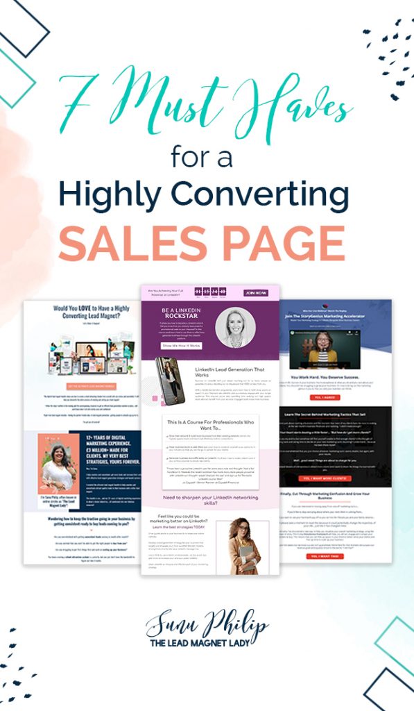
In this article, I outline 7 must haves for a highly converting sales page. Include these elements in your sales page and you’re sure to get your conversion rate up.
1. What problems are you solving?
Whether what you’re selling is a product or service, you’re essentially selling a solution to a problem your ideal client has.
Your sales page should address the problems your audience might be having. When you lay out all the issues they’re currently facing, it helps them identify with it.
They realise what they’ve been struggling with and they know that you empathise with them. This will help them trust you and be more open to the solution you’re providing.
Here are some examples of sales pages with well-defined problems.
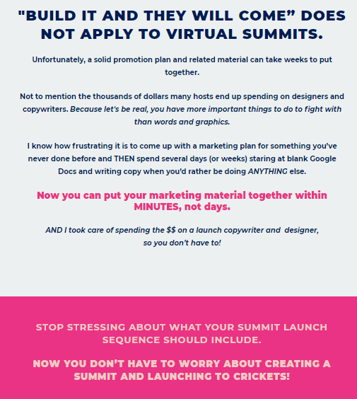
Image Credit: Summit in a Box
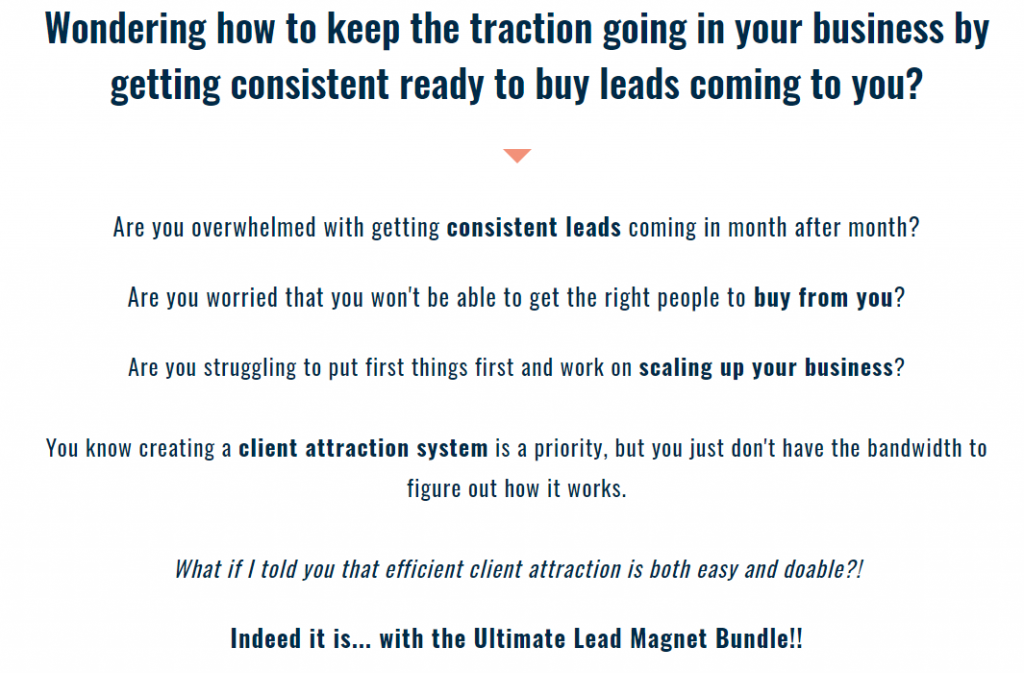
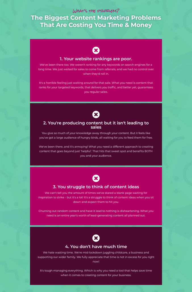
Image Credit: Content Planning Toolkit
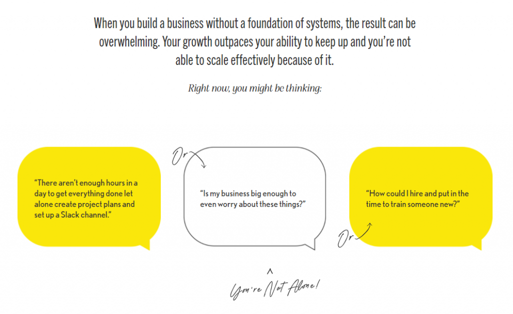
Image Credit: Amy Porterfield
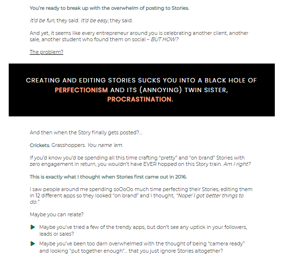
Image Credit: Story Vault
2. What solutions do you provide?
Once the problems are outlined, you can deftly introduce the solutions you’re providing your audience through your offer.
Because your ideal client has already identified themselves with the problems you’ve outlined, they’re in the right frame of mind to accept your solution as well.
When presenting the solution, make sure you show them the outcomes they’ll get when they purchase for your offer. That’s what they’ll be looking for.
Here are some ways to present the solutions that you provide through your offer.
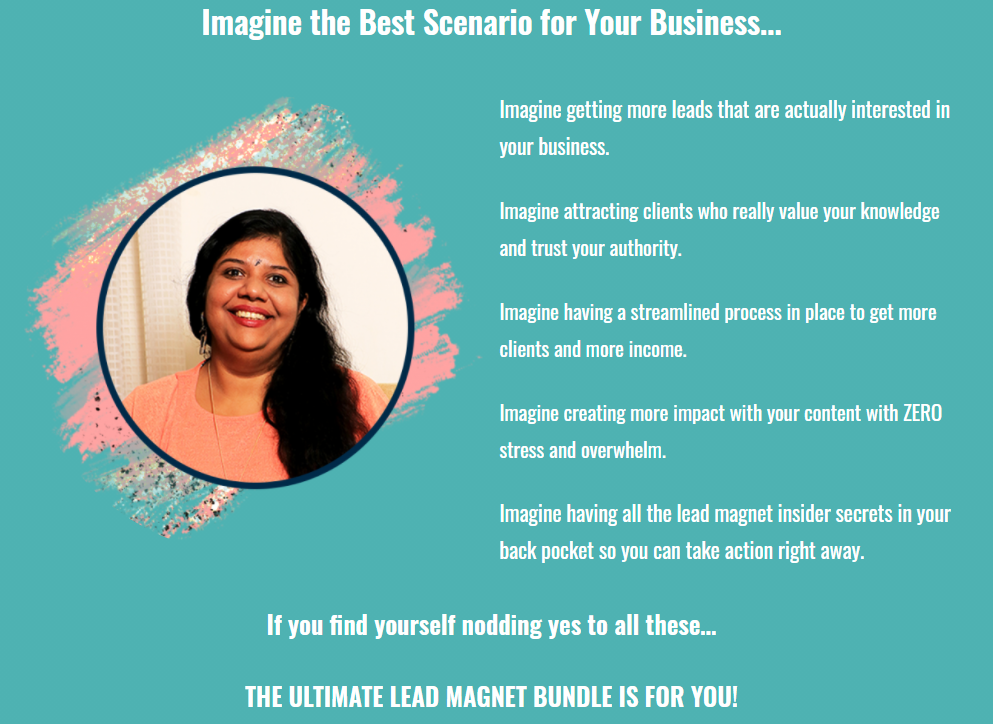
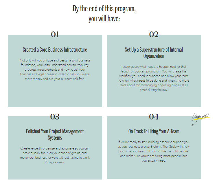
Image Credit: Amy Porterfield
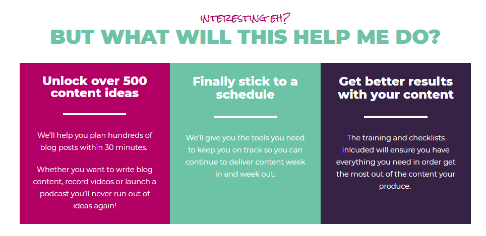
Image Credit: Content Planning Toolkit
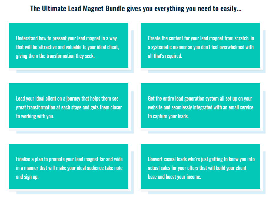
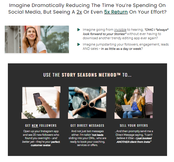
Image Credit: Story Vault
3. What are you offering?
This is where you actually introduce your product or service. It doesn’t have to be a detailed explanation at this point, you can give more details about what’s included in subsequent sections.
In this section, you can present the name of what you’re offering with a flair. If you have graphics to showcase your offer, that’s always a plus.
You can include a short, punchy description of your offer that will grab the attention of your ideal client and give them a gist of what you’re providing them.
Here are some ideas to guide you.
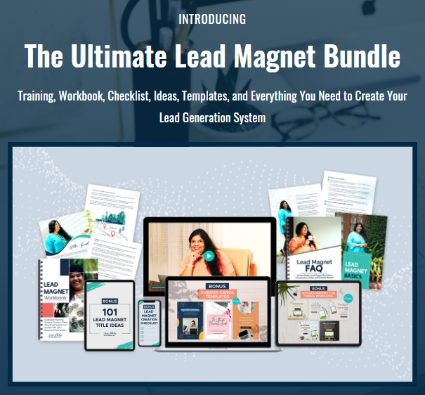
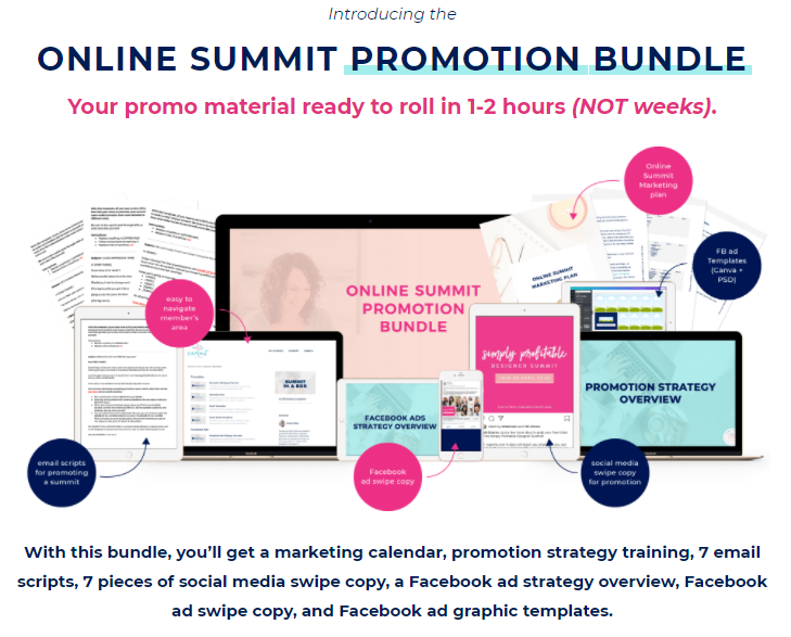
Image Credit: Summit in a Box
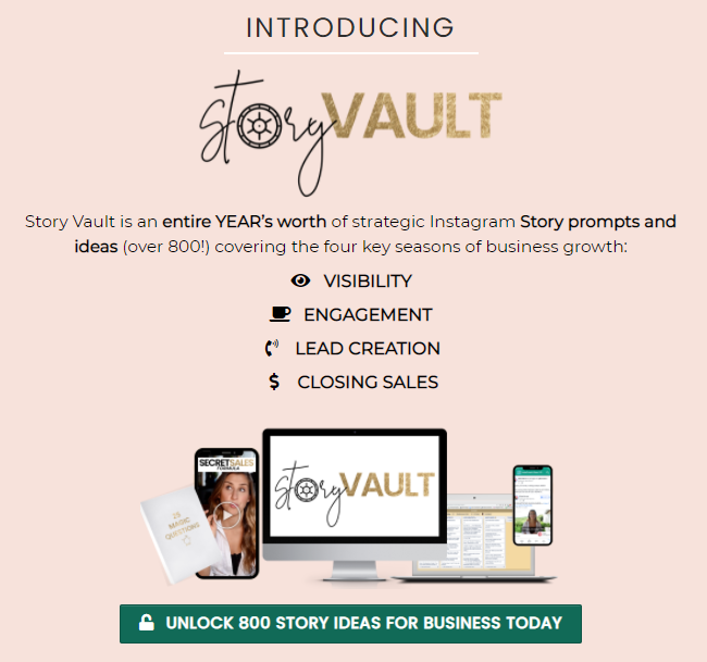
Image Credit: Story Vault
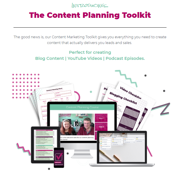
Image Credit: Content Planning Toolkit
4. What’s included in it?
In this section, you’ll be giving a detailed explanation of what’s included in your offer.
You can mention what exactly the ideal client will get when they purchase it, and how they can access it as well. This part can be long or short depending on the price of your offer.
For a low-ticket offer, a short description of the components will do. For a high-ticket offer, you’ll have to go into more detail and provide a comprehensive description of everything that’s included in your offer.
Here are some examples of this section.
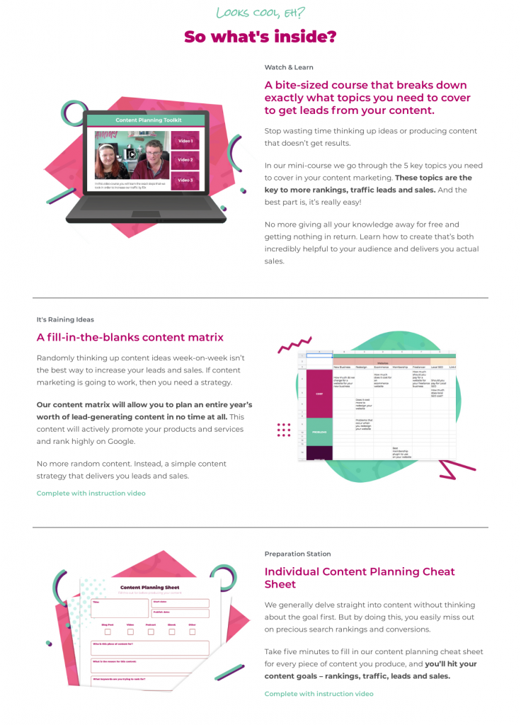
Image Credit: Content Planning Toolkit
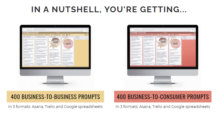
Image Credit: Story Vault
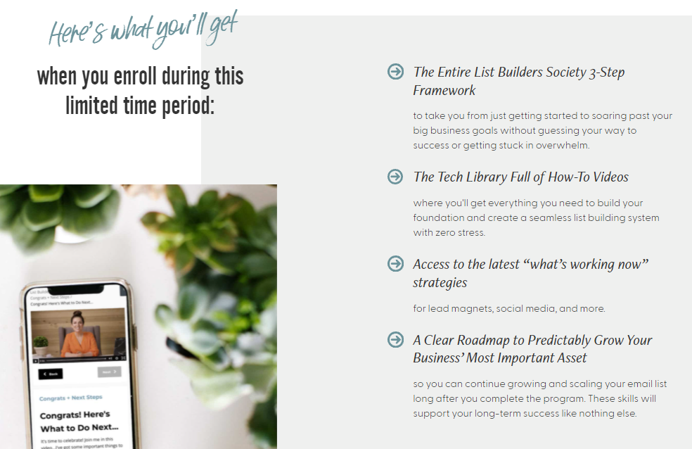
Image Credit: Amy Porterfield
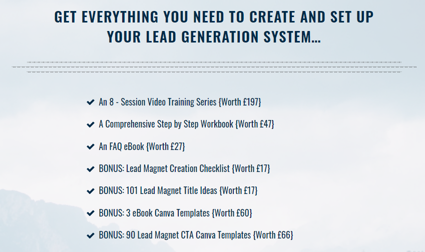
5. Who are you to help them?
It’s imperative for anyone contemplating buying something from you to know who you are. They need to know you’re the right person to solve their problem because you know what you’re doing.
There are many ways you can showcase yourself on a sales page.
- An ‘About’ section detailing who you are and your expertise along with a picture of you.
- Different certifications you’ve undertaken
- Companies you’re associated with
- Publications you’ve been featured in
By featuring yourself on your sales page, you add credibility and showcase your authority in your niche.
This adds more weightage to your offer and your ideal client will be able to trust you enough to buy from you.
Here are some examples to inspire you.
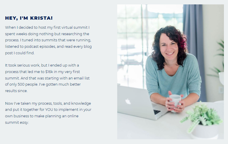
Image Credit: Summit in a Box
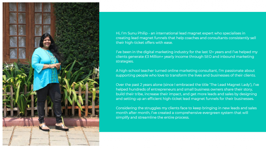
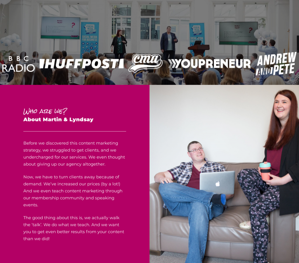
Image Credit: Content Planning Toolkit
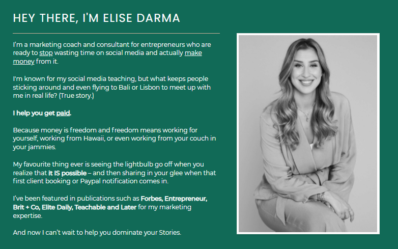
Image Credit: Story Vault
6. What are others saying about it?
People may be skeptical about purchasing something they don’t know much about. But if they see some good feedback and reviews about what you’re offering, they might be convinced into clicking the ‘buy now’ button.
You can collect testimonials from people who’ve already signed up for your offer and feature it on your sales page.
You can present it in the form of:
- Screenshots of clients’ praise from social media
- Customer feedback with their pictures
- Testimonial videos
Here are some examples of how testimonials can be presented on the sales page.
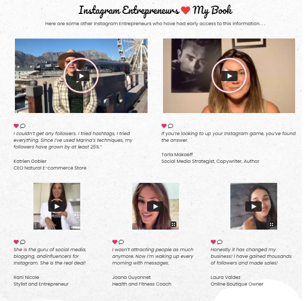
Image Credit: Marina De Giovanni
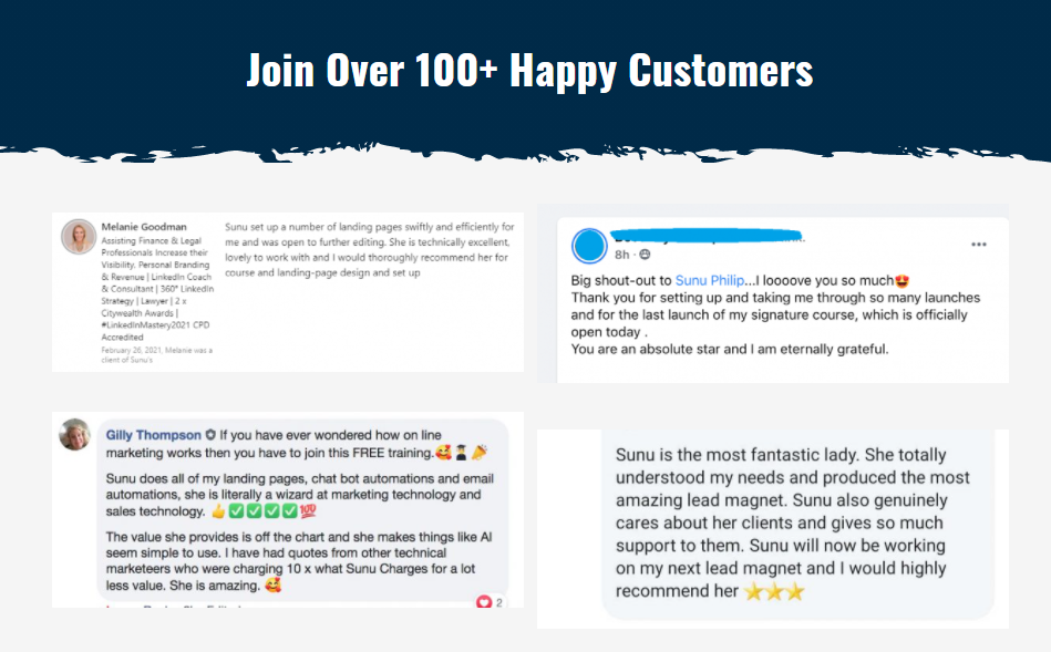
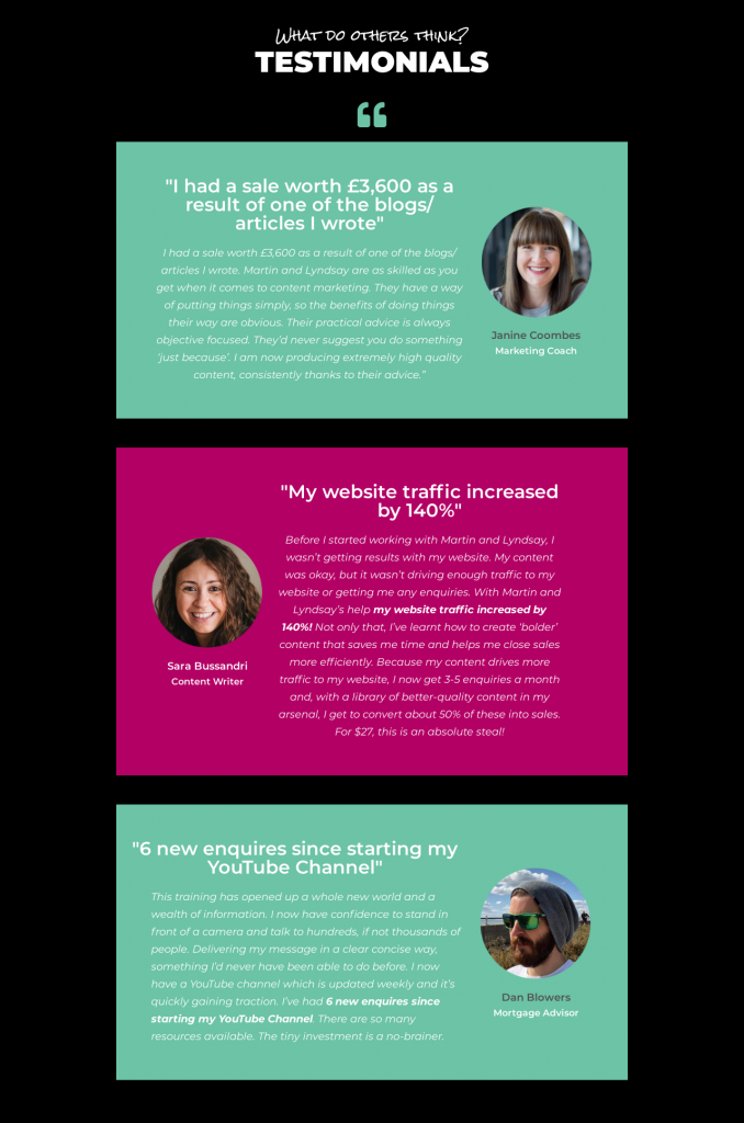
Image Credit: Content Planning Toolkit
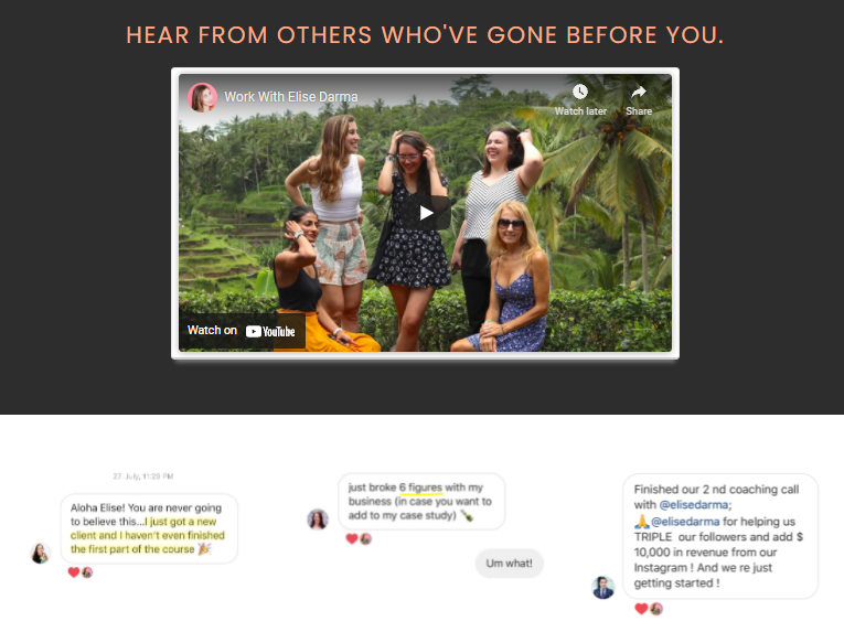
Image Credit: Story Vault
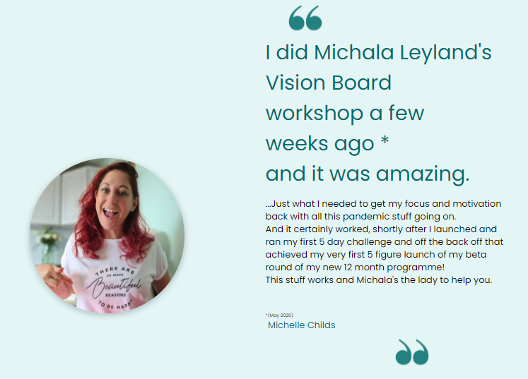
Image Credit: Wood for the Trees Coaching
7. How much does it cost?
One of the most important aspects of your sales page is the price. You don’t have to beat around the bush. You can just share the cost of your offer outright but you don’t have to stop there.
The value of what you’re offering has to be presented so your ideal client knows what they’re getting for that cost.
And that’s not all, you can also include the bonuses and special offers they’re getting, including any limited time discounts you’re giving them.
You can also mention how you accept payments and if you have any payment plans available for those who’d prefer to pay in installments.
Here are some ways you can share the price on the sales page.
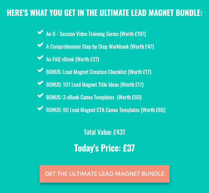
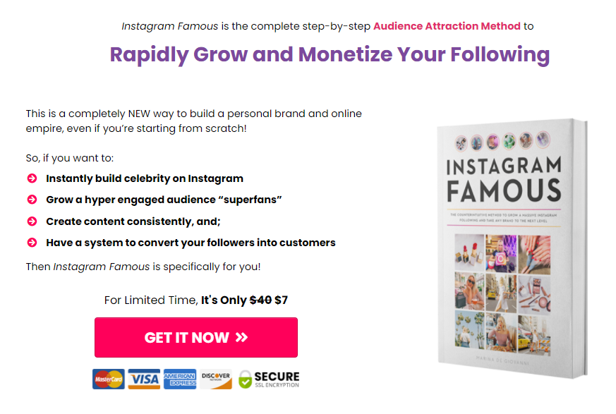
Image Credit: Marina De Giovanni
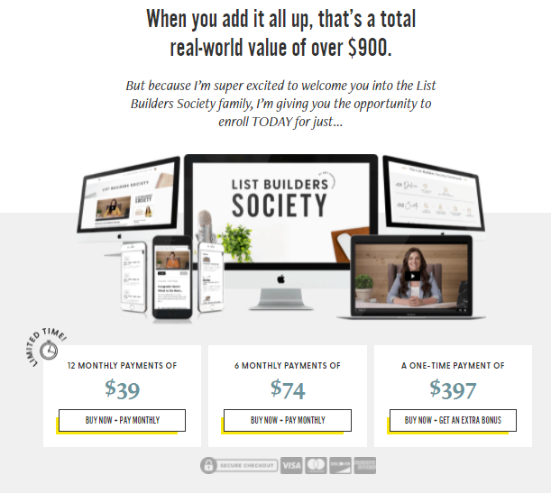
Image Credit: Amy Porterfield
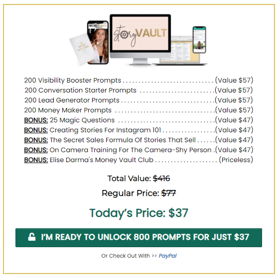
Image Credit: Story Vault
Bonus: What questions might they have?
Yet another element that can be included in the sales page is a section for FAQs.
Most people who visit your sales page will have some questions. In this section, you can answer some of the frequently asked questions and give your ideal client some more clarity about your offer.
Some of the questions you answer can be related to:
- The terms and conditions of your offer
- What are the prerequisites your ideal client should have in place
- What’s covered in the offer and what’s not
- Whether refunds are allowed
- The time duration of the project (for services)
- How people can reach you if they have any more questions
Here are some examples of the FAQ sections to give you some guidance.
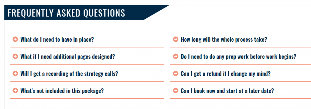
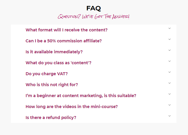
Image Credit: Content Planning Toolkit
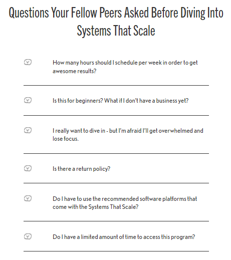
Image Credit: Amy Porterfield
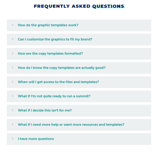
Image Credit: Summit in a Box
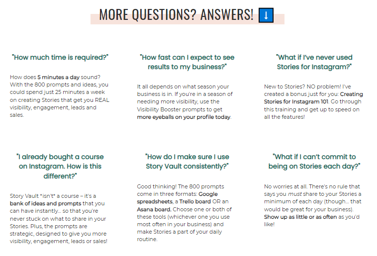
Image Credit: Story Vault
The above list of must haves for a highly converting sales page are not exhaustive. Apart from this, you’ll also have to make sure your sales page includes:
- An engaging headline
- Eye catching graphics
- Storytelling copy that resonates with your audience
- A concise description of who this offer is suitable for
Overall, the length of your sales page and the number of sections you include in it can vary based on what you’re selling.
For a low-ticket product like an eBook or a basic strategy call, you can have a shorter sales page with just 3 or 4 of the sections I’ve outlined in this article.
For high-ticket offers and bigger projects like an eCourse, online mastermind, or done for you services, you’ll probably want to include all the above mentioned sales page must-haves!
Keep in mind that the appearance of your sales page matters. When the content is easy to read through and eye-catching with relevant images, it will keep your ideal client engaged and willing to read through the entire page.
Remember that your ideal client is already interested in your offer, otherwise they would not have clicked through and visited your sales page.
Now, the only thing you have to do is cinch the deal with a fabulously designed sales page!
Looking for someone to take the sales page design (and possibly the copy) off your hands? I’m here for you!
Get in touch with me to see how we can work together.
